GUI Building in NetBeans IDE 4.1
This short tutorial guides you through the process of creating an application
called ColorSwitcher. You will build a simple program that enables you to switch
the color of a panel from light gray to medium gray to black.
During the process of creating ColorSwitcher, you will learn how to:
Getting Started
In the IDE, all Java development takes place within projects. An IDE project
is a group of Java source files plus its associated meta data,
including project-specific properties files, an Ant build script that
controls the build and run settings, and a project.xml file that maps Ant
targets to IDE commands.
Creating a Project
First we need to create the ColorSwitcher Java application, but to do this
we need to create a new project within which to store sources
and other project files. While Java applications are often comprised of several
IDE projects, for the purposes of this tutorial we will build a simple application
which is stored entirely in a single project.
|
To create a new ColorSwitcher application project:
- Choose File
 New
Project (Ctrl+Shift+N). Alternately, you can click the New Project icon
in the IDE toolbar. New
Project (Ctrl+Shift+N). Alternately, you can click the New Project icon
in the IDE toolbar.
- In the Categories pane, select the General folder. In the
Projects pane, choose Java Application and click Next.
- Enter ColorSwitcher in the Project Name field
and specify the project location.
- Ensure the Set as Main Project checkbox is selected and deselect
Create Main Class if it is selected.
- Click Finish.
The IDE creates the ColorSwitcher folder on your system
in the designated location. This folder contains all the project's
associated files, including its Ant script, folders for
storing sources and tests, as well as a folder for project-specific
metadata. You can view this structure using the Files window.
|
Creating a Container
In order to proceed with developing our application, we need to create
a Java container within which we will place the other required
GUI components. After creating the new application, you may have noticed that
the Source Packages folder in the Projects window contains an empty <default
package> node. Now we'll create a container using the JFrame component
and place the container in a new package.
|
To create a JFrame container:
- In the Projects window, right-click the ColorSwitcher
node and choose
New
 JFrame
Form. JFrame
Form.
- Enter ColorSwitch as the Class Name.
- Enter my.colorswitcher.pkg as the Package.
- Click Finish.
The IDE creates the ColorSwitch form and the ColorSwitch class
within the ColorSwitch.java application. The my.colorswitcher.pkg package
replaces the <default package> and
the ColorSwitcher form
opens in the Editor window in Design view.
|
Defining the Project's Main Class
Before
proceding any further, we need to let the IDE know which class is the Main Class
so that build and run commands will work properly. You can set any class
with a main method as the Main Class, but in this case we want to set the ColorSwitcher class
we created in the previous step as the Main Class.
|
To set the Main Class
- In the Project window, right-click the ColorSwitcher project
node and choose Properties.
- In the Categories pane of the Project Properties dialog, select the Run
node.
- In the right pane, click the Browse button to the right of the Main Class
field.
- In the Browse Main Classes dialogue that appears,
select my.colorswitcher.pkg.ColorSwitch and
click Select Main Class.
- Click OK to exit the Project Properties dialogue.
The IDE sets the main class parameter that it references when executing
build and run commands.
|
Getting Familiar with the IDE's Editor
Now that we've setup a new project for our application, let's
take a minute to familiarize ourselves with the IDE Editor interface.
Below is a screengrab of our ColorSwitcher application open in the IDE Editor's Design
view.

When we added the JFrame container, the IDE opened
the newly-created ColorSwitch form
in an editor tab with a toolbar containing
Source and Design toggle
buttons. These buttons enable you to choose between viewing the ColorSwitch class's
source code and a graphical view of its GUI components.
Initially, the ColorSwitch class
opened in Design view and three windows automatically appeared
along the IDE's edges. By default, the Inspector window is docked in the IDE's
lower left corner and the Palette and Properties windows appear along its
right edge, one above the other. Below are descriptions of each of the windows:
- Inspector. Provides a representation of all the components, both
visual and non-visual, in your application as a tree hierarchy. The Inspector also
provides visual feedback about what component in the tree is currently being
edited in the Editor as well as allows you to
organize components in the available panels.
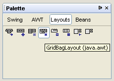
- Palette. Contains tabs for various JFC/Swing, AWT, and JavaBeans
components, along with a selection of layout managers.
- Properties. Displays the properties of the component currently selected
in the Inspector, Editor, Projects or Files windows.
Clicking the
Source button displays the application's
Java source code with sections of code
that are automatically generated by the IDE indicated by
blue Guarded Blocks which
are not editable in Source view. You can type only in the white areas of
the Editor when in Source view.
Clicking the
Design button returns the IDE's Editor
to the graphical view.
Editing the Form
Now that you have created a form and have had a chance to familiarize yourself
with the IDE's GUI tools, it's time to begin developing the nuts and bolts of
our GUI application. In this step we'll
change the JFrame's default layout, add the
necessary GUI elements to the form using the IDE's Palette,
and rearrange them using the GridBag Customizer.
Selecting a Layout Manager
Now that we've added a JFrame as our form's top-level container, the next
step is to specify the Layout Manager we want to use to control the size and
position of the components within the container. Each container type has a
default layout manager. The default layout manager for the JFrame component
is BorderLayout
which divides the container into five sections (north, south, east,
west, and center).
In this step, we'll switch to the GridBagLayout layout manager, which provides
precise control over all aspects of the layout
using a complex set of component properties called "constraints." The GridBagLayout
places components in a grid of rows and columns in which grid cells can vary
in size and components can span multiple rows, columns, or both.
|
To change layout managers:
|
Adding a Button
Now that we've changed the layout manager, we need to add the button that
will actually operate the ColorSwitcher application. Notice the IDE's "pick & drop" behavior
when accomplishing this.
|
To add a button:
- In the Palette window, select
the JButton component from the Swing category.
- Click anywhere on the ColorSwitch form in the Editor to add the
JButton component to the form.
The JButton component appears in the Editor
and its corresponding node is displayed in the Inspector window.
The JButton component's
code is added to the form's source file and is visible in the Editor's
Source view.
|
Now we're going to edit the button so that it displays the correct text
in the desired font style and size.
|
To rename the button and change its display font:
- In the Editor's Design view, right-click the JButton component
and select
Edit Text from the contextual menu. Alternately,
you can simply click the button and push the spacebar to highlight the button's
text.
- Enter
Switch Color in the text field. Press Enter.
- With the JButton component still selected, scroll to the font
property in the
Properties window and click the ellipsis (...)
button.
- In the editor dialog that appears, select Font
Editor from the Select Mode combo box, choose Bold
for font style and 14 for the font size.
- Click OK.
The JButton component label Switch Color appears in larger
bold type.
|
The
Editor displays the Switch Color button centered
in its JFrame container, delineated by a dark purple
border. The remainder of the form should be empty gray space
with a light blue boundary indicating the edge of the JFrame itself.
Adding a Label
Since our application uses a label to display
the colors the button will call, we need to add the label next. In this step
we'll select the
JLabel Swing component from the IDE's Palette and
place it in our ColorSwitch form in the Editor's workspace.
Again, notice the IDE's "pick & drop" behavior
when accomplishing this.
|
To add a label component:
- In the Palette window, select the JLabel component in
the Swing category.
- Click anywhere on the ColorSwitch form in the Editor to add the JLabel component to
the form.
A label with the text jLabel1 is displayed in the Editor and
a node named jLabel1 [JLabel] is displayed
and highlighted in the Inspector window's tree
view. In addition, the JLabel component's
properties are displayed in the Properties window
and its source code is added to the form in the Editor's Source
view.
|
Using the GridBag Customizer to Adjust the Layout
Unlike other Layouts, the GridBagLayout displays no properties in the
Properties window when selected in the Inspector
window.
Instead, the IDE's GridBag Customizer enables
you to visually adjust the placement and constraints of components using the
GridBagLayout. It includes a property sheet for GridBag constraints, buttons
for adjusting the constraints, and a rough depiction of the components' layout.
|
To adjust the form's layout using the GridBag Customizer:
- To open the GridBag Customizer, right-click
the GridBagLayout node in the Inspector window
and choose Customize.
- In the workspace area (the customizer's right pane), reposition the JButton
by clicking its center and dragging it below the JLabel component.
As you drag the button, a black and red grid indicates the positions
available. Notice also the Grid X and Grid Y properties in the left
pane change to reflect the component's new position.
- Select the JLabel component
and adjust the JLabel's Fill constraint to Horizontal,
so that the label completely fills the cell above the button. Then set
its Internal Padding Y constraint to 33.
- Once the approximate layout of the components has been established, select
both the JLabel and JButton by pressing Control while clicking
the components.
- Set the Insets (left,
right, top and bottom) for both components to 5 to increase the space between
the components by clicking the Increase Inset buttons ("+") in the
customizer's lower left corner. The GridBag
Customizer displays
the insets with light yellow margins around the components.
- Click Close to exit the GridBag
Customizer.
The IDE updates the edited components to reflect their new positioning
and other constraints. Although the Editor's Design
view does not display a grid, it now contains a single column and
two rows.
|

Though the GridBag Customizer is where you actually
edit the form when using the GridBag layout, the Editor's Design
view more closely reflects how the components will look at runtime. In addition,
it is often helpful to sketch out the way you want your layout to look before
using the GridBag
Customizer.
Making the Final Adjustments to the Form
Now that we've arranged the two components in our form, we need to edit the
label so that it will change color when activated by the Color Switcher
button. We'll do this by removing
the label's text and altering its opacity property so that it will only display
the color when the button is clicked.
|
To edit the label's properties:
- In the Editor's Design view, select the JLabel
component.
- In the Properties window, scroll to the text
property, select the current jLabel1 name, and delete the text leaving the
text field blank. Press Enter.
- Scroll down to Other Properties, select
the checkbox for the opaque property, and press Enter again.
The jLabel1 text disappears from the component,
however, its purple selection highlighting
remains visible in the Editor's workspace. Note also that
the jLabel is still selectable via its corresponding node in the Inspector.
|
Finally, we need to adjust our form's properties so that it will display
in an appropriately sized window when we run the application.
To edit the form's properties:
- In the Editor's Design view, select
the JFrame container in the Inspector window.
- In the Properties window,
choose the Code button to display the Code Generation options.
- Set the Form Size Policy option to Generate Resize Code and ensure
that the Generate Size Code option
is set to True.
- Change the Form Size by
clicking the property's ellipsis button. Enter 200 in the
Width field and 150 in the Height field, then press Close.
Whenever you run the application, the form will be generated in
a window with the new dimensions.
|
Setting Component Events
Now that you have created the necessary components and added them to our
application's form, we need to establish the interactivity between them
and the end user. There are several
ways to do this, but for the purposes of this tutorial we'll focus on using
the Editor's Source view to enter the code directly.
Setting Up the Button
The first thing we need to do is set up the button to switch color. In this
step we'll add the method for the user input we want and the
listener code that will watch for it.
|
To add the mouse event:
- Place focus in the Editor window (in Design
view), if it's not already.
- Right-click the jButton1 component (the Switch Color button) and
choose
Events Mouse mouseClicked.
The focus switches to Source view containing the Java source code for
the ColorSwitcher class. The IDE generates the listener code jButton1.addMouseListener and
event method jButton1MouseClicked(). Notice that the cursor
is placed on the line where we'll add the event handling code in the
following step.
|
 |
The guarded blocks of Java code automatically
generated by the IDE have a
light blue background and cannot be edited directly in the Source
view. To make changes code within a guarded block, click the Design button
to return to Design
view. |
Adding an Event Handler
Once the jButton1MouseClicked() method has been created, you
can add custom code for handling this event when it occurs. The goal is that
each click of the Switch Color button will change the color of the label.
|
To add event handler code:
- Locate the Navigator
window in the lower left corner of the
IDE,
and select JButton1 from the list of
your ColorSwitcher application's elements. The cursor appears at the beginning
of the JButton1 variable declaration in the JButton1's blue guarded
block.
- Move the cursor to the line below the variable declaration section (on
or about line 80).
|
You can display line numbers in Editor's Source
view by right-clicking in the left margin and choosing Show
Line Numbers. |
- Declare the following new variable:
private java.awt.Color currentColor = java.awt.Color.lightGray;
- In the Navigator window, select jButton1MouseClicked,
select the text //Add your
handling code here: below
the guarded block (on or about line 62), and type the following:
if (currentColor == java.awt.Color.lightGray)

    currentColor = java.awt.Color.gray;

else if (currentColor == java.awt.Color.gray)

    currentColor = java.awt.Color.black;

else

    currentColor = java.awt.Color.lightGray;

jLabel1.setBackground (currentColor);
|
Note that the last line is jLabel with
the number one ("1") preceeding the period and not the letter "l". |
- Save the file by choosing File
Save (Ctrl + S).
The IDE stores your code and places an error icon to the left of any line
where it finds a problem.
|

|
As you work you can preview the form by
clicking the Test
Form button in the Editor's Design view toolbar.
The form opens in its own window, allowing you to test it prior to
buliding and running. |
Adding GUI Components with the Palette Manager
Before trying our application out we'll take a quick look at another of the
IDE's useful tools, the Palette Manager,
pictured below.
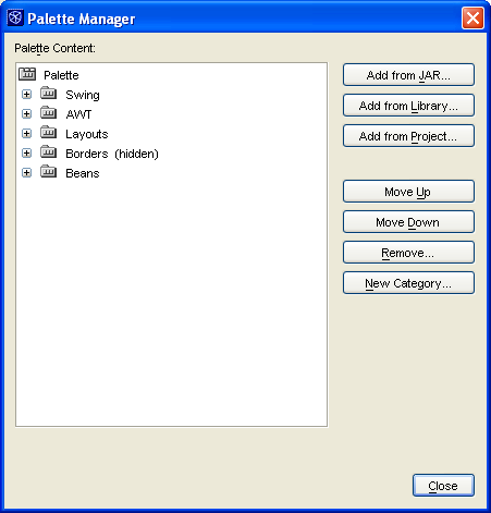
If you work with custom components, beans, or component libraries, you can
add them to the IDE's Palette window using the Palette
Manager. You can also use the Palette Manager to
assist you in adding, removing, and organizing
Palette window components such as
Swing components, AWT components, Layouts, and beans.
To launch the Palette Manager, choose Tools Palette
Manager.
Seeing the ColorSwitcher Application in Action
Now that you have successfully built the ColorSwitcher form,
you can try your application to see the results.
Compiling and Running Your Program
Now that we've created the user interface and the connections between the
components, you can compile and run your application.
|
To compile the program:
- Compile the entire project application by selecting the ColorSwitcher node
in the Projects window and choosing Build Build
Main Project
(F11).
The Output window opens to display the progress
and any errors that occur. If the build is successful, the "Finished building
ColorSwitcher (jar) " message
appears in the status bar at the bottom of the main window. Note that
the "jar" mentioned in parentheses indicates that the IDE has also created
a jar file containing your application's sources.
|
If there are problems with the build, error messages are displayed in the Output window. You
can double-click an error message to jump to the line in the source code
where the error occurred. Once the build is successful, you can run the
application.
|
Alternately, you can skip the build step
and simply run your program. The IDE will compile any classes
that are out of date automatically before running the program. |
|
To run the program:
- Run the ColorSwitcher application by choosing Run Run
Main Project (F6).
Once again the Output window opens to display the
IDE's progress.
If there are execution errors, the IDE displays both the Output and Execution windows.
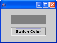
If the run command is successful, the ColorSwitcher application is displayed
and should appear similarly to the image below.
|
In the application
window, click the Switch Color button to check that your application is working
properly and the label above the button actually changes color. With each
successive click of the button, the area above the button should change from
light gray to medium gray to black.
When you are finished testing your application,
exit the application by simply closing the window.
For Further Investigation
You have now completed the IDE's GUI Building tutorial. For
more information on using NetBeans IDE, see:
- NetBeans Online Help. The documentation included in NetBeans IDE
itself. Press F1 to open the online help.
- Using
NetBeans IDE. The complete guide to developing Java applications in
NetBeans IDE.
- NetBeans Support and Docs.
Full list of articles, FAQs, and mailing lists for NetBeans IDE users.
Copyright and Trademark Notice